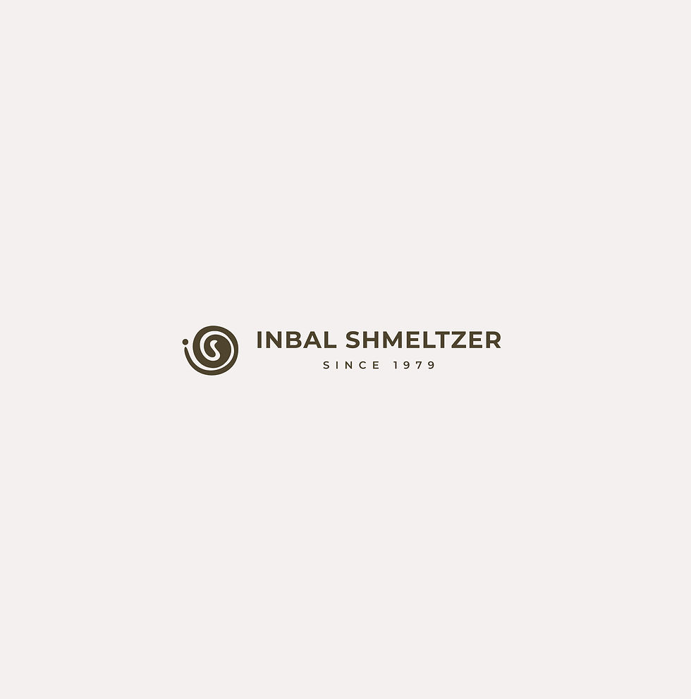
Inbal Shmeltzer
E-Commerce | Artist inner child
Branding & Website
Mission
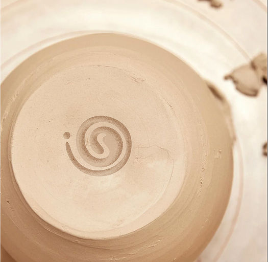
To design a brand that opens the doorway to the inner world—where the little girl still holds her lollipop and whispers forgotten truths. The goal was to capture this tender, raw essence in a visual identity. The logo was born from the initials IS, symbolizing both her name and her existence: “It is what it is”—a declaration of self and being.
Results
-
A soulful, personal brand that reflects the emotional depth of Inbal’s art and story
-
A logo that holds presence, softness, and truth—anchoring her identity in simplicity and meaning
-
The artist felt fully seen through the branding and began creating with renewed confidence
-
Sales and recognition grew as the brand resonated deeply with audiences seeking emotional connection and authenticity
Values
Connection | Truth | Healing
Brand Essence
Your inner child signature